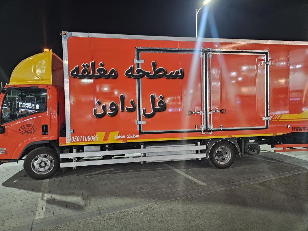
سطحه مغلقه
حي حطين. حي الرائد. حي عرقه. حي النخيل. حي السفارات. حي العقيق. حي الغدير. حي العليا.
سطحات متخصصه في خدمه العملاء
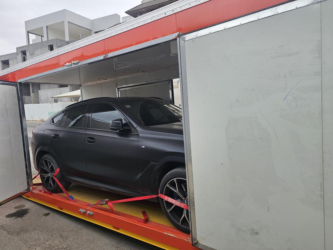
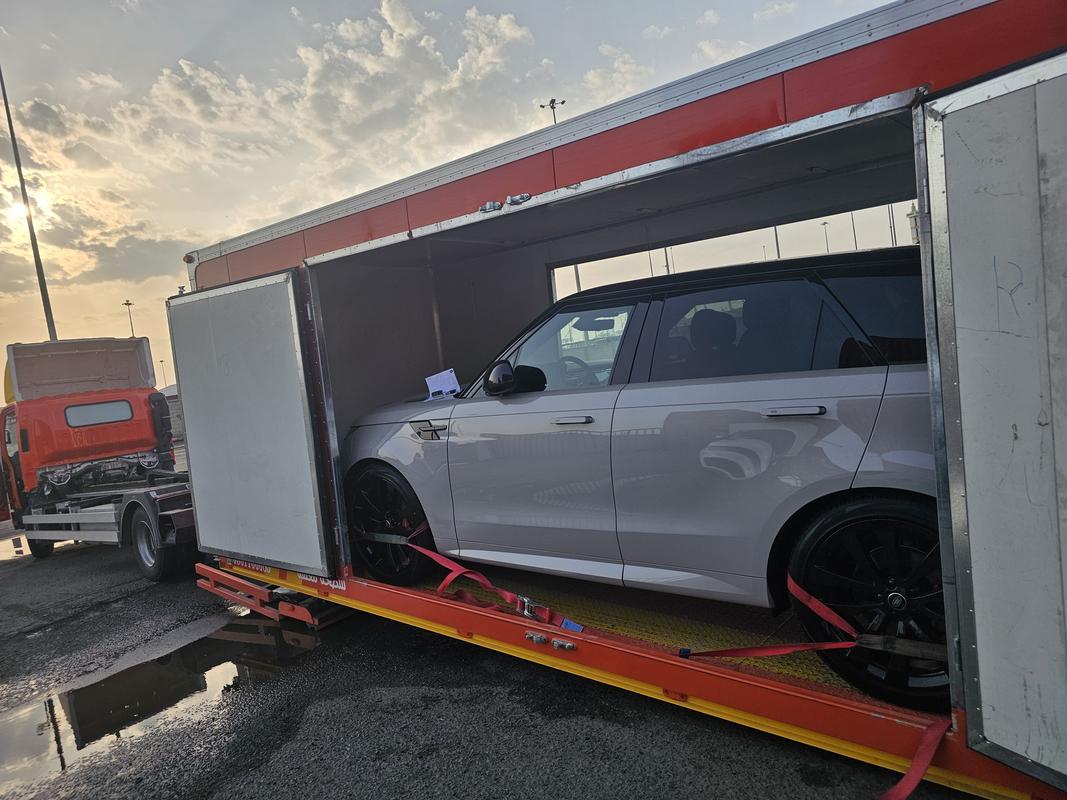
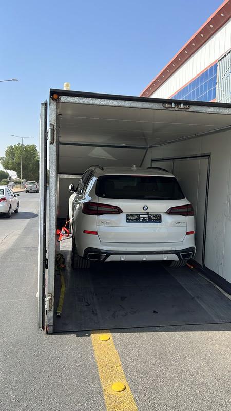
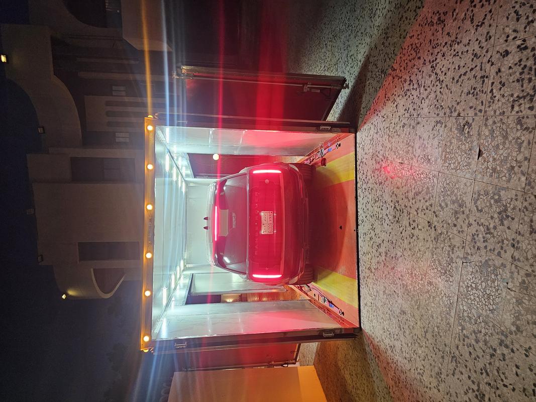
سطحة مغلقة لنقل السيارات – شمال الرياض
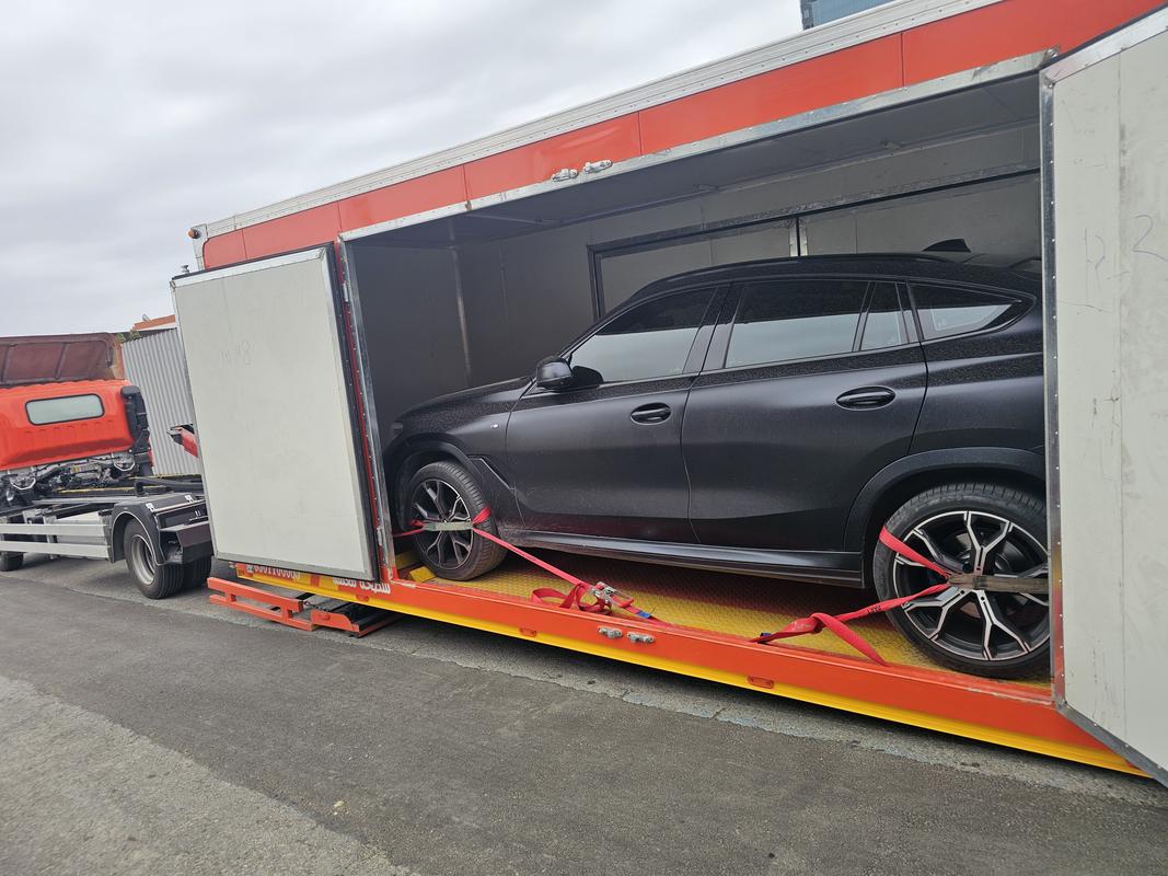
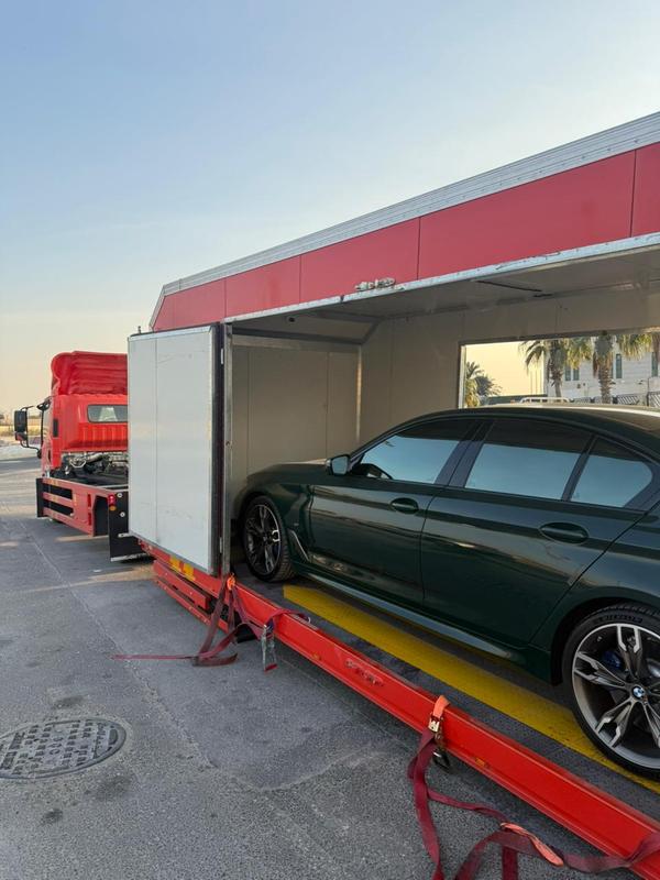
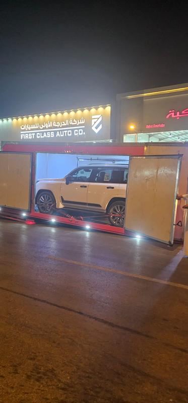
نقدم خدمة سطحة مغلقة لنقل السيارات بأعلى درجات الأمان داخل شمال الرياض، حيث نوفر نقل السيارات الفاخرة والرياضية والجديدة باستخدام سطحات مغلقة مخصصة لحماية السيارة من الغبار والعوامل الجوية أثناء النقل.
تعتبر خدمة السطحة المغلقة الخيار الأفضل لنقل السيارات ذات القيمة العالية أو السيارات الجديدة من المعارض، حيث يتم نقل السيارة داخل شاحنة مغلقة بالكامل لضمان أقصى درجات الحماية.
الأحياء التي نخدمها في شمال الرياض
نوفر خدمة سطحة مغلقة في العديد من أحياء شمال الرياض مثل:
حي حطين
حي الرائد
حي عرقة
حي النخيل
حي السفارات
حي العقيق
حي الغدير
حي العليا
خدماتنا
خدمه مواصفات ومقاييس
- نقل السياره من باب البيت الى المواصفات والمقاييس وارجاعها الي باب البيت
المعرض
ساعات العمل 24 ساعه
اتصل بنا
معلومات الاتصال
نحن على استعداد دائم لخدمتكم والإجابة على جميع استفساراتكم حول خدماتنا على مدار الساعة.